
Introduction
In this tutorial, we will build an animated progress ring, similar to Apple’s Fitness Rings. We will use react-native-svg to render the ring and React Native Reanimated to animate it 🤩
The end result will look like this

Video tutorial
If you prefer a video tutorial, we built this component live (0:30:00 → 1:20:00) on our channel.
Let’s get started: Environment
We will use Expo Snack to build this component directly in our browser. Open it up, and let’s get started.
I tested this project on Expo SDK V47. To make sure everything works for you as well, select this version from the drop drown on the bottom right of the screen.
Install the dependecies
To render the SVG element, we will use react-native-svg.
To animate it, we will use react-native-reanimated.
To add them to our project, open the package.json file, and add them there:
"react-native-svg": "13.4.0","react-native-reanimated": "~2.12.0"
The last step before we jump in is to clean a bit our App.js file. Delete all the unnecessary things, and leave only the main container
import { View, StyleSheet } from 'react-native';import Constants from 'expo-constants';export default function App() {return (<View style={styles.container}></View>);}const styles = StyleSheet.create({container: {flex: 1,justifyContent: 'center',alignItems: 'center',paddingTop: Constants.statusBarHeight,backgroundColor: '#ecf0f1',padding: 8,},});
Now, our workspace is ready to start building.
Progress Ring UI using SVG
Let’s create our progress ring as a separate component. This will help us move it to another project easily.
For that, create a new file RingProgress.tsx inside the components directory, and render a simple text.
import {View, Text} from 'react-native'const RingProgress = () => {return (<View><Text>Ring Progress</Text></View>)}export default RingProgress;
Let’s import and render it inside the App.js
import { View, StyleSheet } from 'react-native';import Constants from 'expo-constants';import RingProgress from './components/RingProgress';export default function App() {return (<View style={styles.container}><RingProgress /></View>);}
Alright, now we should see the text on the device, and we are ready to focus on the RingProgress component.
1. Render the container
Our RingProgress component will receive the radius as a property. Knowing the radius, we can start by displaying a square with a size double the radius to fit our circle.
import {View} from 'react-native'type RingProgressProps = {radius?: number}const color = "#EE0F55";const RingProgress = ({radius = 70}: RingProgressProps) => {return (<View style={{width: radius * 2, height: radius * 2, backgroundColor: 'teal'}}></View>)}export default RingProgress;
With this update, we should see the square in the middle of the screen.
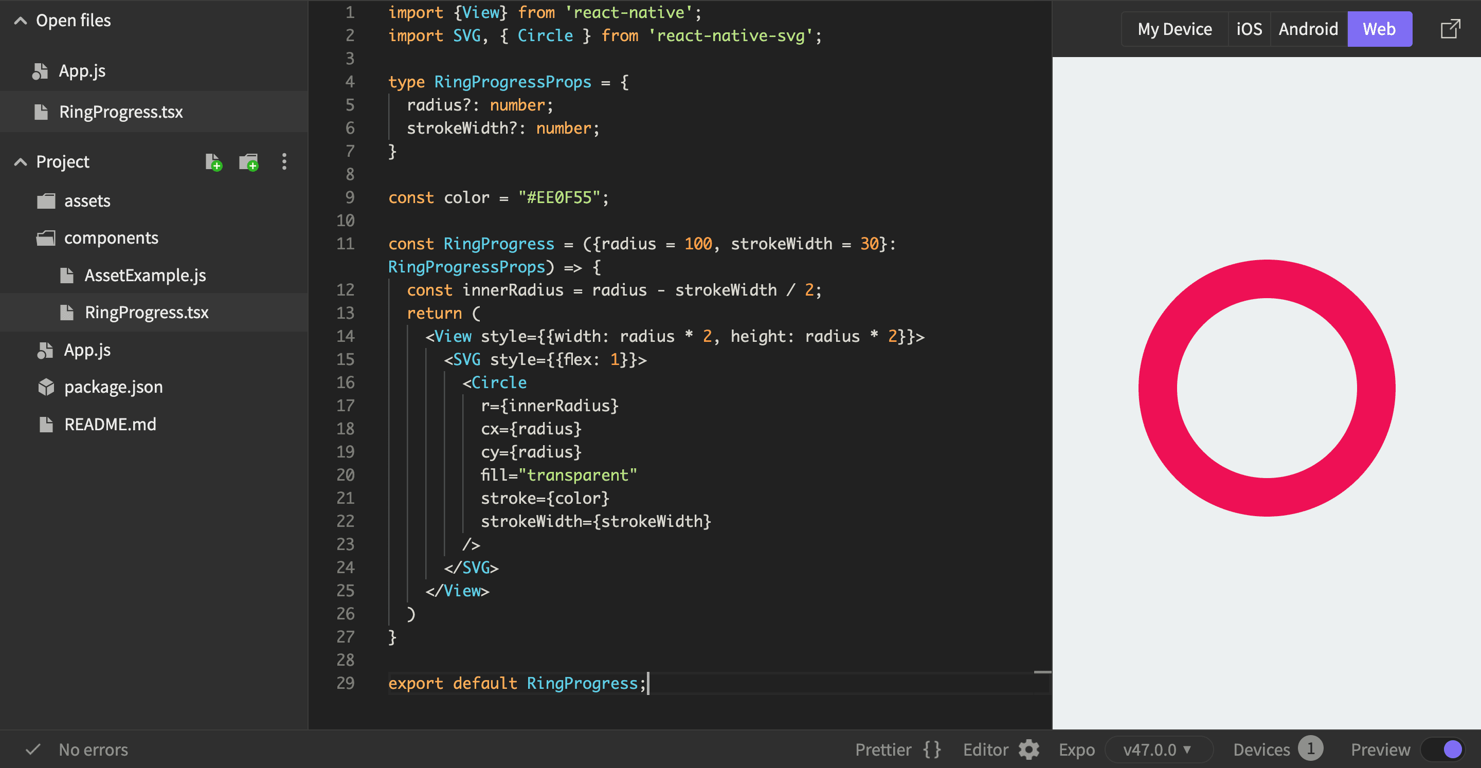
2. Render a circle using react-native-svg
Let’s render a circle using react-native-svg, that we already installed. To learn more about this library, check out their GitHub Repo or this quick Expo guide.
All we have to do is render the <SVG /> component and a <Circle /> inside it.
For the <Circle />, we will position it in the center of the canvas using cx and cy for the centerX and centerY values.
import {View} from 'react-native';import SVG, { Circle } from 'react-native-svg';type RingProgressProps = {radius?: number}const color = "#EE0F55";const RingProgress = ({radius = 100}: RingProgressProps) => {return (<View style={{width: radius * 2, height: radius * 2, backgroundColor: 'teal'}}><SVG style={{flex: 1}}><Circler={radius}cx={radius}cy={radius}fill={color}/></SVG></View>)}export default RingProgress;
Now, we should see a full circle inside a square. Small steps to the final result 🤩
3. From a circle to a Ring
To render the ring, we will use the stroke of the circle. Let’s add a new property strokeWidth that the RingProgress component will receive, and assign it to the strokeWidth of the rendered <Circle />.
We will switch our color to be assigned to the stroke itself, and make the fill of the circle "transparent".
type RingProgressProps = {radius?: number;strokeWidth?: number;}const color = "#EE0F55";const RingProgress = ({radius = 100, strokeWidth = 30}: RingProgressProps) => {return (<View style={{width: radius * 2, height: radius * 2, backgroundColor: 'teal'}}><SVG style={{flex: 1}}><Circler={radius}cx={radius}cy={radius}fill="transparent"stroke={color}strokeWidth={strokeWidth}/></SVG></View>)}
Something is shaping up. We see the donut, but it looks like it doesn’t fit inside our container.
The problem is, that the stroke width grows in both directions: towards the center of the circle, and also away from it.
That means, that now, the whole shape does not fit inside the 2 * radius width.
Let’s consider the property radius as the radius of our ring (circle + stroke), and based on it, calculate the inner radius of the circle, by subtracting half of the width of our stroke. I hope it makes sense.
const innerRadius = radius - strokeWidth / 2;
And change the r property of the <Circle /> to this inner radius.
<Circler={innerRadius}.../>
Now, our circle fits inside the container, and we see our beautiful ring.
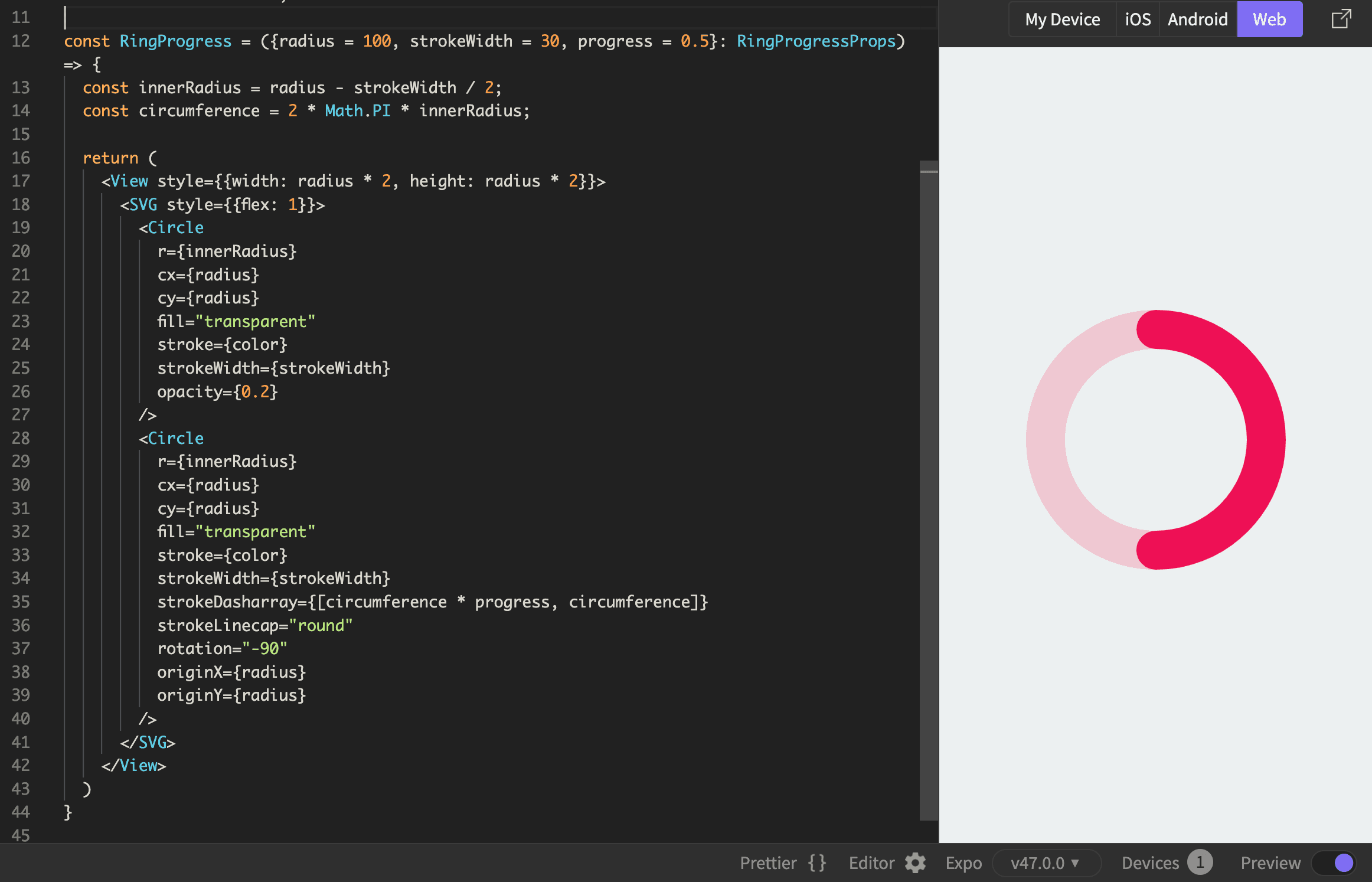
4. Background ring
We will overlay 2 rings on top of each other. One for the background and one for the foreground. So, simply duplicate your circle, and add opacity={0.2} for the background circle.
<SVG style={{flex: 1}}>{/* Background */}<Circler={innerRadius}cx={radius}cy={radius}fill="transparent"stroke={color}strokeWidth={strokeWidth}opacity={0.2}/>{/* Foreground */}<Circler={innerRadius}cx={radius}cy={radius}fill="transparent"stroke={color}strokeWidth={strokeWidth}/></SVG>
5. Render the ring based on the progress
Our component will receive a new property progress with values between 0 and 1. Based on this progress, we need to fill our progress bar.
Because our ring is in fact the stroke of a circle, we will do some tricks to render it partially to represent the progress.
For that, we will display it as a dashed stroke. The dash stroke can be adjusted with 2 values: the lengths of the dashes and the distance between them.
For example, by adding strokeDasharray={[25, 50]} to the foreground circle, you will see that the stroke of the circle became dashed, where the length of the dashes is 25 pixels, and the distance between them is 50.
Now that we are working with the length of the stroke, to know the full length of our stroke, we should calculate the circumference of the circle. Let’s calculate it based on the formula C = 2 * π * R
const circumference = 2 * Math.PI * innerRadius;
Now, by using it for our dash lengths, we can have our partially filled ring.
strokeDasharray={[circumference * 0.5, circumference]}
With this, you should see half of the ring.
The last step is to replace the hardcoded 0.5 with the progress property.
type RingProgressProps = {radius?: number;strokeWidth?: number;progress?: number;}const RingProgress = ({radius = 100, strokeWidth = 30, progress = 0.5}: RingProgressProps) => {...
strokeDasharray={[circumference * progress, circumference]}
6. Last touches
To make the ring round at the margins, add the strokeLinecap="round" property.
Let’s make our ring start from the top. For that, rotate the circle -90 degrees, and make sure you set the origin of rotation to be the center of our canvas.
{/* Foreground */}<Circle...strokeLinecap="round"rotation="-90"originX={radius}originY={radius}/>
We can also display an icon on top of the ring.
import { AntDesign } from '@expo/vector-icons';...return (<View style={{width: radius * 2, height: radius * 2}}><SVG style={{flex: 1}}>...</SVG><AntDesignname="arrowright"size={strokeWidth * 0.8}color="black"style={{position: 'absolute',alignSelf: 'center',top: strokeWidth * 0.1,}}/></View>)
Now, our component should look like this.
Let’s animate our ring
When you open up the Apple Fitness application, the rings have a nice animation that shows how the ring fills up.
Let’s do that using React Native Reanimated.
Let’s start by converting the Circle component into an AnimatedCircle component
import Animated from 'react-native-reanimated'const AnimatedCircle = Animated.createAnimatedComponent(Circle);
Then, for the Foreground circle, use the AnimatedCircle component. This allows us to animate either the styles or even the properties of our Circle.
We will animate how much the ring progress is filled. For that, let’s define this variable fill that will drive our animation
Import all the needed functions first:
import Animated, {useSharedValue, useAnimatedProps, withTiming} from 'react-native-reanimated'import {useEffect} from 'react';
Shared value: fill
To drive animations, which run on the UI thread, we need to use shared values. Create the fill shared value, and in a useEffect, whenever the progress changes, assign it to the fill.value.
const fill = useSharedValue(0);useEffect(() => {fill.value = progress}, [progress]);
Animated props
Create the animated props that will use the fill shared value
const animatedProps = useAnimatedProps(() => ({strokeDasharray: [circumference * fill.value, circumference]}))
And send them to our <AnimatedCircle />
<AnimatedCircleanimatedProps={animatedProps}
Now, if we send different progress values from the App.js file to our <RingProgress /> components, we should see the ring update, but it’s not smoothly animated yet.
Animate using withTiming
To make our ring fill-in smoothly, in the useEffect where we update the fill value, instead of setting it right away to the current progress, let’s smoothly move it in that direction during a short period of time. We will do that using the withTiming function
useEffect(() => {fill.value = withTiming(progress, {duration: 1500})}, [progress]);
Let’s see it in action
Everything should be working now, but we will not see it inside our Snack window. We have to run it on our physical device, by scanning the QR from the "My device" tab using Expo Go on your phone.
After you see the app on your physical device, you should see the progress smoothly animated. Go ahead, and update the progress value sent to <RingProgress /> inside App.js and see the animation in action.
Demo
Here you can see the final solution.
To run it on your device, switch to "My device" in the lower right corner, and scan the QR code.
If you want to see the code of the RingProgress component, open this snack in a new window.
Check other episodes from the Health Application with React Native: Step Counter series