Introduction
In this tutorial, we will build a clone of the Tesla app in just a few hours. This tutorial is perfect for beginners who want to learn the basics of app development and React Native, as we will go step-by-step and explain everything on our way. By the end, you'll have a fully functioning app that you can customize and build upon. So, let's get started and build your first app together!
Create a brand new Expo app
Let’s start by initializing a new Expo project by running:
npx create-expo-app@latest -e with-router TeslaApp
After that’s done, open the application folder with your editor of choice.
To run the application, we have to open a new terminal and navigate to the application directory. If you are using the terminal from VScode, the terminal automatically opens in the current directory.
Now, let’s start the development server by running
npm start
We should see the expo dev server. From there, we can either scan the QR code with our physical device using the Expo Go app or run the application on an iOS simulator by pressing i or android emulator by pressing a.

App directory
As we are using Expo router, we will have to create a new directory called app in the root of our project for all our screens.
Expo Router is a file-based navigation system, and for every file inside the app directory, expo router will automatically create a route for it.
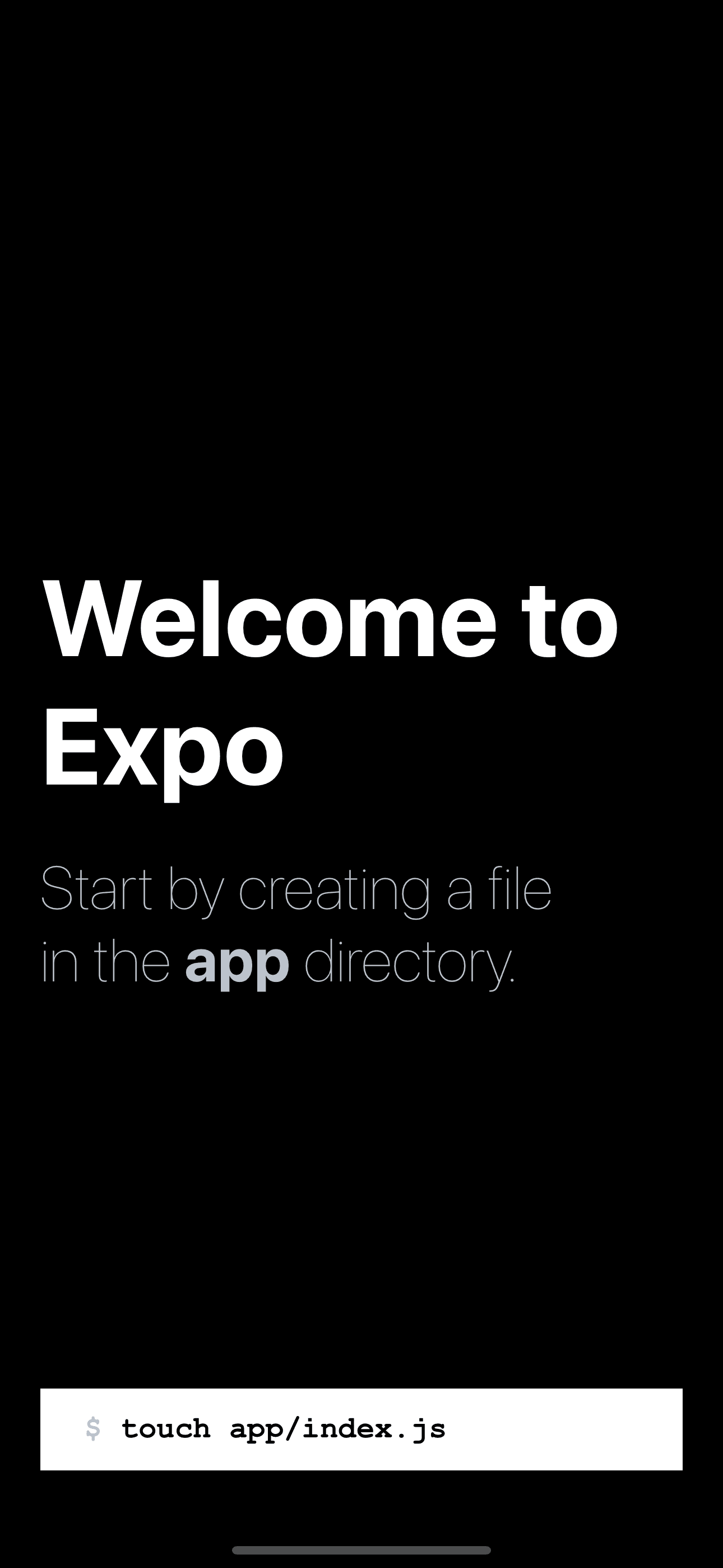
If we press the button "touch app/index.js" from the application, it will automatically create the app folder with the main screen inside app/index.js, and the app should automatically re-render to display the new screen. How cool is that 🤩
Let’s open this file, and start working on our app.
Tesla Home screen
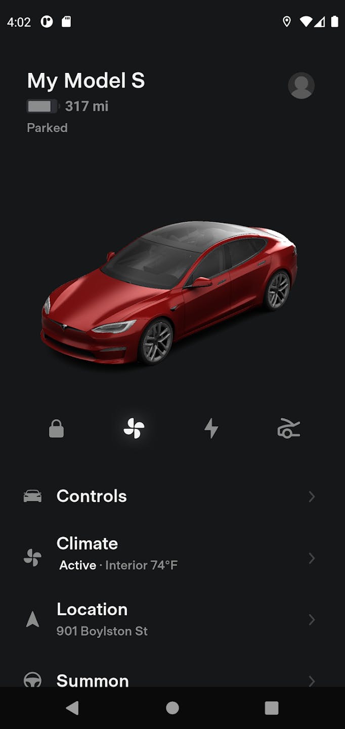
Let’s start working on the Tesla home page.

That looks beautiful 😍
Where do we start?
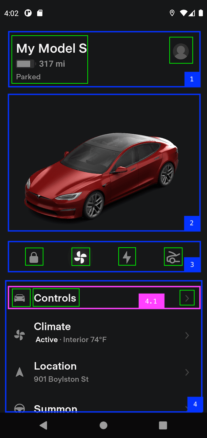
Let’s break down the UI into smaller components. This will help us easier structure and build the UI.

Now, if we describe in words what we see on the home screen, it will make more sense:
- Header
- Model name, charge status
- Profile icon
- Car image
- Controls
- A list of icons
- List of options
- List options
- Option Icon
- Option name
- Open Icon
- List options
Home screen header
First things first: let’s change the background color of the main container to a dark color: backgroundColor: '#161818'. That’s already better 👌
Let’s open app/index.js and start building our screen from the top, starting with the header.
The header is a container made up of 2 columns. On the left, we have information about the car, and on the right, we have an icon.
import { StyleSheet, Text, View } from 'react-native';import { FontAwesome } from '@expo/vector-icons';export default function Page() {return (<View style={styles.container}><View style={styles.header}><View><Text style={styles.title}>My model S</Text><Text style={styles.subtitle}>Parked</Text></View><FontAwesome name="user-circle" size={30} color="gray" /></View></View>);}const styles = StyleSheet.create({container: {flex: 1,padding: 24,backgroundColor: '#161818',},header: {marginTop: 50,flexDirection: 'row',justifyContent: 'space-between',},title: {fontSize: 24,fontWeight: 'bold',color: '#eee',marginBottom: 8,},subtitle: {fontWeight: '500',color: 'gray',},});
Working with Images in React Native
The next step is to render the Tesla Car image on the screen.
For that, we will use the <Image> component imported from react-native and an actual png image that we will import from the assets.
import { Image } from 'react-native';import car from '../assets/images/car.png';
Let’s render the <Image> component right after the header container, and send the car image as the source
<Image source={car} style={styles.image} resizeMode="contain" />
For the styles, we will make the image full width of the screen and will limit the height to 300 pixels
image: {width: '100%',height: 300,},
That’s it. Our app already starts looking better.
Controls
The next step on our Home screen is the row with all the quick controls displayed as icons.
First, let’s import all the Icon families from @expo/vector-icons
import {FontAwesome,Entypo,MaterialCommunityIcons,FontAwesome5,Ionicons,} from '@expo/vector-icons';
And now, render them inside a container
<View style={styles.controls}><Entypo name="lock" size={26} color="gray" /><MaterialCommunityIcons name="fan" size={26} color="gray" /><FontAwesome5 name="bolt" size={26} color="gray" /><Ionicons name="car-sport-sharp" size={26} color="gray" /></View>
To put them in the same row, let’s add the flexDirection style prop to the container styles
controls: {flexDirection: 'row',justifyContent: 'space-around',},
List of options
Before we handle the list of options, let’s start by rendering one option row.
One option row is made of an icon, the name of the option, and on the right the open icon.
<View style={styles.optionRow}><MaterialCommunityIcons name="car" size={26} color="gray" /><Text style={styles.optionText}>Controls</Text><MaterialIconsname="keyboard-arrow-right"size={24}color="gray"style={{ marginLeft: 'auto' }}/></View>
And the styles for the container and the name
optionRow: {flexDirection: 'row',alignItems: 'center',marginVertical: 20},optionText: {color: '#eee',fontSize: 18,fontWeight: 'bold',marginLeft: 10,},
Now that can render one option item, we should put it together and render a list of options.
Firstly, we will import the data that contains the information on all the options we have to display.
import menuOptions from '../assets/menuOptions';
To render them, we will use a <FlatList> component. A Flatlist helps us render infinite scrollable lists. We just tell the FlatList what data we want to render, which should be an array, and also how to render each item in that arrow.
<FlatListdata={menuOptions}renderItem={({ item }) => (<View style={styles.optionRow}><MaterialCommunityIconsname={item.iconName}size={26}color="gray"/><Text style={styles.optionText}>{item.name}</Text><MaterialIconsname="keyboard-arrow-right"size={24}color="gray"style={{ marginLeft: 'auto' }}/></View>)}/>
Custom components
Our Home screen file is getting bigger and harder to manage.
To make sure that our app remains easy to maintain and easy to scale with new features that we will add, we should start extracting chunks of code into custom components.
Let’s start by creating a custom component for our Menu Option list item inside components/MenuOption.js
import { View, Text, StyleSheet } from 'react-native';import { MaterialCommunityIcons, MaterialIcons } from '@expo/vector-icons';const MenuOption = ({ item }) => {return (<View style={styles.optionRow}><MaterialCommunityIcons name={item.iconName} size={26} color="gray" /><Text style={styles.optionText}>{item.name}</Text><MaterialIconsname="keyboard-arrow-right"size={24}color="gray"style={{ marginLeft: 'auto' }}/></View>);};const styles = StyleSheet.create({optionRow: {flexDirection: 'row',alignItems: 'center',marginVertical: 20,},optionText: {color: '#eee',fontSize: 18,fontWeight: 'bold',marginLeft: 10,},});export default MenuOption;
And back inside app/inde.jx, our FlatList will use this custom component to render items
<FlatList data={menuOptions} renderItem={MenuOption} />
Assignment: try extracting the controls row that is rendered above the FlatList in a separate component.
Linking
When we press one menu option, we should navigate to a new screen.
For that, we will use the <Link> component from expo-router inside the components/MenuOption
const MenuOption = ({ item }) => {return (<Link href={item.href} asChild><Pressable style={styles.optionRow}>...</Pressable></Link>);};
Climate Screen
Let’s create a new page for the page that renders the climate control. For that, create a new file app/climate.js
import { View, Text } from 'react-native';const ClimateScreen = () => {return (<View><Text>climate</Text></View>)};export default ClimateScreen;
Now, if you press on the climate option from the home page, you should be redirected to the newly created Climate control page.
If you still see the text "Unmatched Route", double-check the href of the climate option from assets/menuOptions.js to match the name of your file inside the app folder.
Time to practice
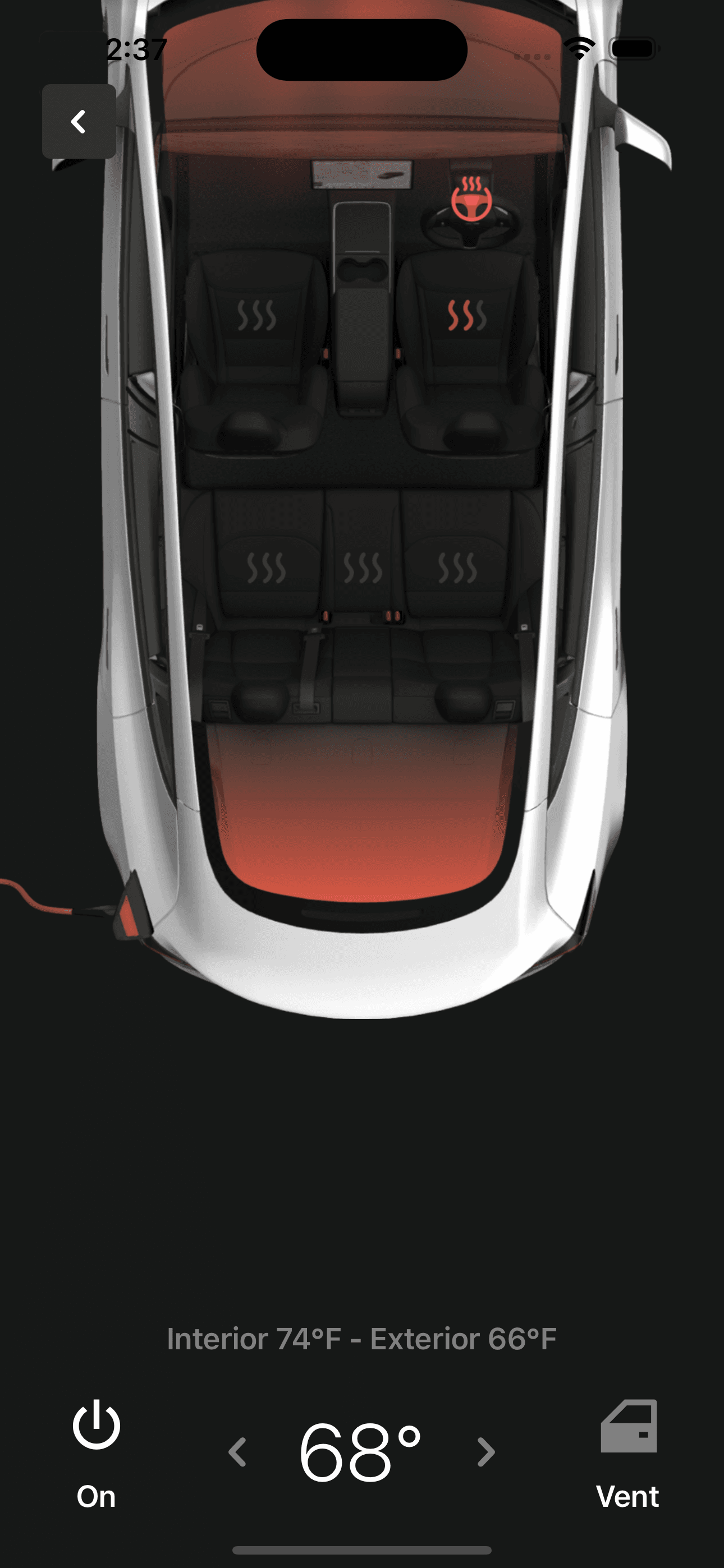
Now, it is time for you to practice. For that, try to build the Climate control page. Start by breaking down the page into smaller components, and then one by one, implement them. There is nothing new. You will still have to work with Images, texts, icons, and views.
You will find the image inside the assets folder.

Well done! Even if you didn’t manage to make it perfect as it is in the screenshot, I think you still managed to learn a lot by doing it yourself.
Here you can see the way I implemented it
import { View, Text, Image, StyleSheet, Pressable } from 'react-native';import climateImage from '../assets/images/climate.png';import { MaterialCommunityIcons, Entypo } from '@expo/vector-icons';import { useRouter } from 'expo-router';const ClimateScreen = () => {const router = useRouter();return (<View style={styles.container}><Image source={climateImage} style={styles.image} resizeMode="cover" /><Pressable onPress={() => router.back()} style={styles.back}><Entypo name="chevron-left" size={24} color="white" /></Pressable><View style={styles.footer}><Text style={styles.label}>Interior 74°F - Exterior 66°F</Text><View style={styles.controlsRow}><View style={styles.iconButtonContainer}><MaterialCommunityIcons name="power" size={42} color="white" /><Text style={styles.iconButtonText}>On</Text></View><View style={styles.temperatureContainer}><Entypo name="chevron-left" size={30} color="gray" /><Text style={styles.temperatureText}>68°</Text><Entypo name="chevron-right" size={30} color="gray" /></View><View style={styles.iconButtonContainer}><MaterialCommunityIcons name="car-door" size={42} color="gray" /><Text style={styles.iconButtonText}>Vent</Text></View></View></View></View>);};const styles = StyleSheet.create({container: {flex: 1,backgroundColor: '#161818',},back: {position: 'absolute',top: 50,left: 25,backgroundColor: '#2f3030',padding: 10,borderRadius: 5,},image: {width: '100%',height: '65%',},footer: {alignItems: 'center',padding: 12,marginBottom: 20,marginTop: 'auto',},label: {color: 'gray',fontSize: 18,fontWeight: '600',marginVertical: 20,},controlsRow: {flexDirection: 'row',width: '100%',justifyContent: 'space-around',},temperatureContainer: {flexDirection: 'row',alignItems: 'center',},temperatureText: {fontSize: 48,fontWeight: '300',color: 'white',marginHorizontal: 20,},iconButtonContainer: {alignItems: 'center',},iconButtonText: {color: 'white',fontSize: 18,fontWeight: '600',marginTop: 10,},});export default ClimateScreen;
Conclusion
I hope you enjoyed this build as much as I enjoyed putting it together.
If you really want to put your skills to the test, then don’t stop here. Go ahead and implement a couple more screens yourselves and this way you will 10x your React Native skills.


